Reimagining Onboarding
- Role
- Lead UX Designer
- Duration
- 4 months
- Team
- 2 Designers, 3 Engineers, 1 PM
- Tools
- Figma, Maze, Hotjar, Notion
Overview
Finova, a digital-first banking platform, was experiencing a 62% drop-off rate during their onboarding flow. Users abandoned the process primarily at the identity verification and financial profiling stages. I was brought in to redesign the entire onboarding experience, grounded in user research and behavioral psychology principles.
Discovery
Understanding the friction
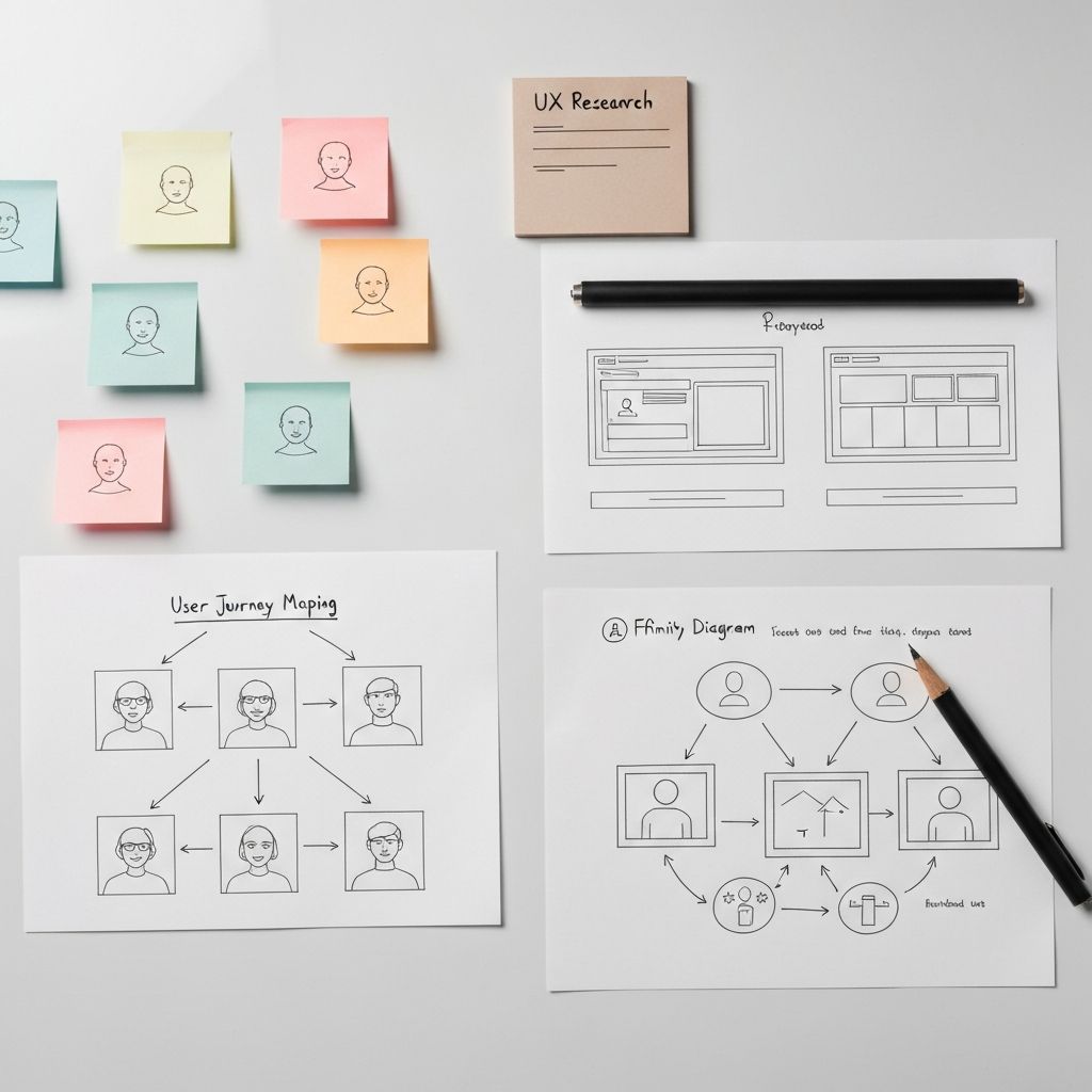
I started with a comprehensive audit of the existing flow, supplemented by 12 in-depth user interviews and analysis of session recordings from over 2,000 onboarding attempts. Three critical insights emerged.
First, users felt overwhelmed by the amount of personal information requested upfront. Second, the identity verification step lacked clear progress feedback, creating anxiety. Third, the financial profiling questions used jargon that alienated non-expert users.
We synthesized these findings into a journey map that highlighted the emotional arc of onboarding — from initial curiosity through the valley of frustration to eventual relief upon completion. This map became our north star for the redesign.
Ideation
Progressive disclosure as a framework
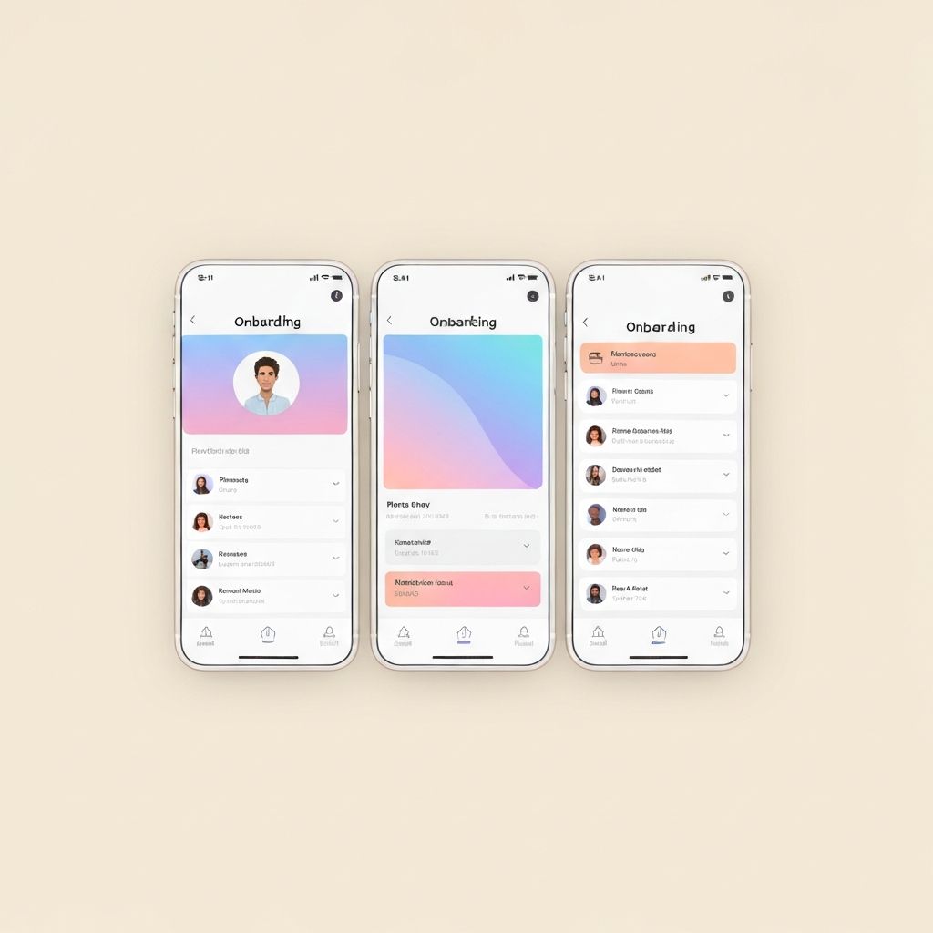
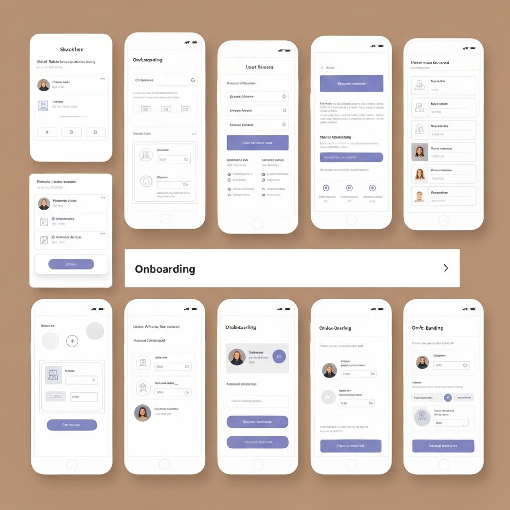
The core insight was simple: don't ask for everything at once. I introduced a progressive disclosure model where the onboarding is broken into distinct, digestible chapters — each with a clear purpose communicated to the user.
We prototyped three variants: a linear step-by-step flow, a conversational chat-style approach, and a chapter-based model with skip-ahead capability. After testing all three with 24 participants, the chapter-based model won decisively — users reported feeling more in control and less fatigued.
Each chapter was designed with its own micro-reward moment: a subtle animation acknowledging completion before smoothly transitioning to the next section. This leveraged the Zeigarnik effect — the tendency to remember incomplete tasks — keeping users engaged through the full flow.
Execution
Refining the details
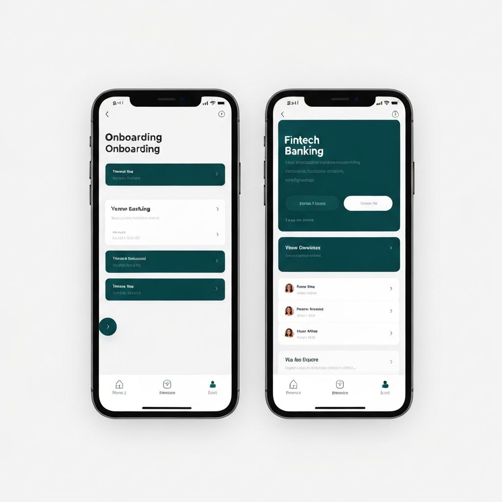
In the high-fidelity phase, I focused on three pillars: clarity, encouragement, and trust. Every screen was stripped of unnecessary elements. Copy was rewritten to use plain language — 'What do you typically use a bank for?' instead of 'Select your primary financial objectives.'
The identity verification step was redesigned to show a real-time progress indicator with estimated time remaining. We added contextual tooltips explaining why each piece of information was needed, which tested significantly better for trust perception.
I worked closely with engineering to ensure animations stayed under 300ms, keeping the experience feeling snappy without sacrificing the polish. We also implemented smart defaults and auto-fill suggestions based on device data to reduce manual input by approximately 40%.
Results
Measurable impact
Reflection
This project reinforced my belief that great UX is often about removal, not addition. The most impactful changes were the things we took away — unnecessary questions, confusing jargon, and visual clutter. By respecting users' time and cognitive load, we created an onboarding experience that felt less like a form and more like a conversation.
Next Project